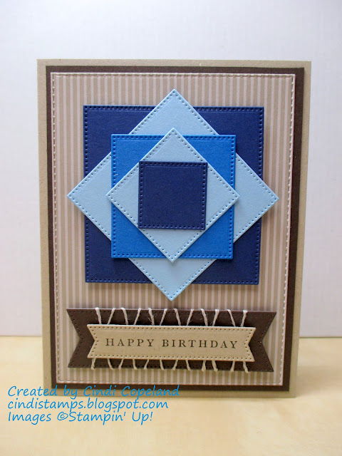
Hello and welcome back! A couple of weeks ago I created a card for the As You See It Challenge and was selected as a Featured Artist. So now I get to be a guest designer for this recipe challenge! Here's my card:
And here is the recipe for this week's challenge:
I'll be the first one to admit that masculine cards are difficult for me. I love to use bling and flowers and ribbon - all the girly stuff! That's why I decided to try a geometrical design instead. The blue squares were die cut using the squares from the Stylish Shapes Dies. I rotated each one to create this quilt block-type focal point. I brought in the earth tones in the Crumb Cake card base and Early Espresso layers, along with the sentiment piece. The twine is linen thread wrapped around the larger sentiment layer.
Thanks for stopping by, and happy stamping!
--Cindi
Supplies used (all Stampin' Up!):
Stamp set - Cottage Rose
Paper - Crumb Cake, Night of Navy, Balmy Blue, Pacific Point, Early Espresso Cardstock; Neutrals DSP
Ink - Early Espresso
Accessories - Linen Thread
Tools - Big Shot, Stylish Shapes Dies, Stitched Rectangles Dies, Multipurpose Liquid Glue, Stampin' Dimensionals, Mini Glue Dots


such a great card Cindi - love how you've incpororated all the elements of the recipe into a geometric design. Great to have you guesting with us at As You See It!
ReplyDeleteCindi, this card is gorgeous! I had a hard time getting it out of my head, as I tried to design my own. Elements of yours kept trying to creep in! That's how big an impression it made! So glad you could design with us at As You See It!
ReplyDeleteCindi, this is gorgeous! I love the interplay of the triangles that comes from your arrangement of the squares. Perfect choice for background paper - very masculine! Thanks so much for playing along with us and for agreeing to guest design for this challenge.
ReplyDeleteThis is a GREAT way to use those colors for a masculine card! I believe I will be borrowing this idea myself! SO cool and yet so simple!
ReplyDeleteCindi I think you smashed it! I love your clean and graphic design and your layered squares are really eye-catching. Love the twine detail behind the sentiment too - a great masculine card. Thanks for guesting with us over at As You See It Challenge this week!
ReplyDeleteSo beautiful, Cindi - LOVE your take on our recipe! I will totally be CAS-ing this idea - like a gorgeous quilt! And what a fun way to sneak in the twine - so clever! Thanks so much for guest designing with us at As You See It!
ReplyDelete